Last night I was reading through the latest issue of Rolling Stone — really loved the cover feature on Mad Men, as well as the profile on SNL creator Lorne Michaels — and seeing how they branded the issue’s theme (“Fall Television”) made me wonder just how relevant that particular imagery really is these days. The branding in question is what you see pictured above — it appears with all of the TV-related articles in the issue — and is of course inspired by the TV test patterns of old (pictured below, and technically known as “SMPTE color bars,” as I learned through Wikipedia).
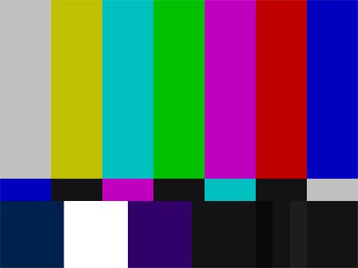
As a retro effect, it works — I certainly remember them — but has anyone under the age of 20 ever seen one? As far as I know — and keep in mind that I’ve been living in Japan for 10+ years — they haven’t been used in at least a decade, and not just because they’re not necessary anymore (in this world of digital sets), but also because we live in a world with 24-hour broadcasts.
I’m just curious as to whether it’s still a good icon or image to use when referring to TV, although I’m the first to admit that I liked how it was used, and I can’t think of anything off-hand that would work better.