
I’ve been meaning to do a write-up on The Times‘ iPad version of its monthly Eureka science magazine for way too long now, and please don’t think that it’s because I don’t think it’s good. In fact — and as Jeremy also quite plainly stated in his review — quite the contrary, as I think it’s one of the best iPad magazine releases so far.
What’s especially impressive is that I find this magazine to be interesting even though I normally would not be inclined to pick up a magazine about science. But Eureka on iPad does so many cool things with the digital format that it’s worth picking up for that fact alone — and it’s ridiculous not too, since it’s also priced at a mere $1.
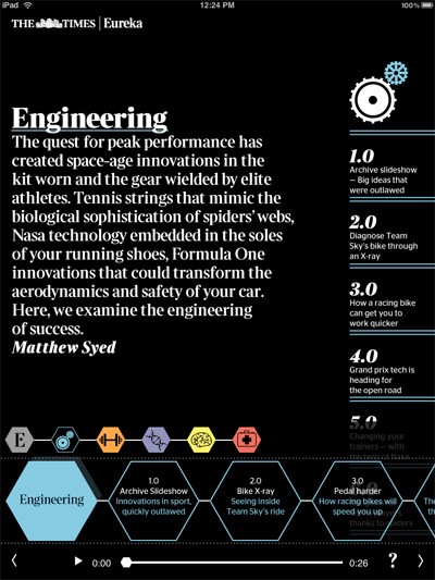
It all kicks off with a graphically pleasing table of contents that lets you quickly zoom into the different sections of the magazine, using an atomic structure-like layout that suits the theme perfectly. You can also move around to different sections with a pop-up guide on the bottom, which is similar to the ones used in the Times iPad app, but with a graphical touch up.


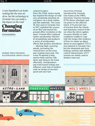
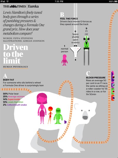
It also does an amazing job of using imagery to enhance articles, and as with more and more iPad magazines these days (and to be fair, it was something I first saw in the Times app), it uses the landscape mode for extra content, like detailed slideshows and the like. I wonder why so many UK-based publications are doing this, but so far it’s not really happening on the US side.
Without going into too many details, let’s just say that you’ll find beautiful layouts and fun interactive features throughout, and so it’s well worth picking for a look at what a true graphic-heavy iPad magazine can look like (as opposed to the farce that is the New York Magazine app). Sure, there are still certain issues — still no text manipulation, and no sharing tools — but there’s still a lot to like, and as I said earlier, at $1 you can certainly check it out for yourself.