We’d been waiting for it for a while, and last week finally marked the release of the first iPad edition of Wired UK. I was especially interested in seeing what the team behind the UK spinoff would come up with in terms of layout and format — just how different or similar to the US edition — using the same Adobe digital tools.
The biggest change is that the magazine has decided to embrace the portrait layout exclusively, using the landscape mode to access any multimedia features (videos, slideshows, etc.)

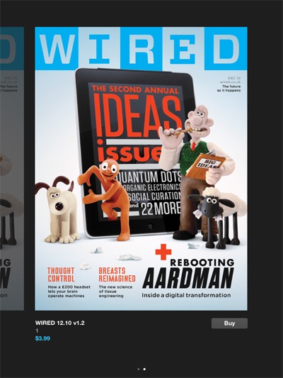
There are certain exceptions, like the issue’s cover, as well as all of the ads found inside, and that does in fact make sense. Even when in landscape mode, you can flip through the pages and go from media section to media section, and so you still encounter the ads. When you hit articles that don’t have any extra content, you get the message pictured above.
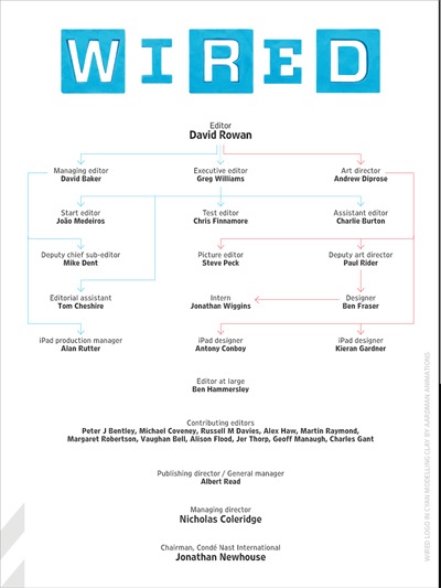
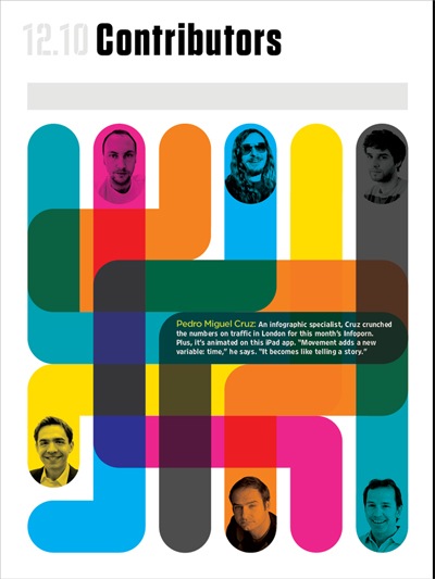
Continuing with a look at some of the changes, you get a much more creative masthead — I really like the use of arrows to indicate the proper “chain of command” — and a “Contributors” page that not only looks good, but is interactive in a way that is fun and works quite well with the color mix used (you touch on a contributor’s photo to have the appropriate text appear in the colored segments).
But the real genius of the magazine is that idea of using the landscape mode to show off the media content, which means that all photos and videos appear in all their full-screen glory (there’s one video that was smaller, that I can remember), instead of as a tiny box which is part of the article layout. What is especially a joy to experience are the 360 degrees images, which are just stunning in full-screen, and something that only an iPad edition of a magazine could offer — twirling around the sets of Aardman Animations’ latest film is so much more satisfying and revealing than a series of photos could ever be.


But even the basic photo slideshows are great to take in, and not only can you flip through the images of the slideshow, but when you are in landscape mode, you’ll also flip through all of the multimedia content associated with an article. Going back to portrait mode brings you back to the article, and more precisely, to the part of the article (the “screen”) that is linked to the media content.
It can get a bit out of hand though, like in the case of the audio clip that accompanies the article below (which happens to be the cover feature of the US edition this month). Having to turn to landscape mode just to then tap a small button to activate a sound file isn’t necessary (in the US iPad edition, the button of the clip is simply included in the article).
This also brings up a problem I’ve had with sound clips in general with Wired, both US and UK — the fact that you can’t continue to navigate while the clip plays. For example, I don’t really want to stare at a “screen” while listening to a music clip, I’d rather like to move on to the next article.

The other thing that I was really interested to find out with the UK edition was just how different the content would be from the US edition — this becomes especially important with the iPad app, since it gives Wired UK a worldwide audience, which means they really need to offer something different than the “mother” edition. From what I saw in this issue, I’d say that the vast majority is new content, enough to justify the purchase — I think only 4-5 articles from the US edition were used.
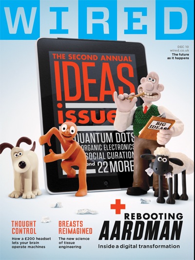
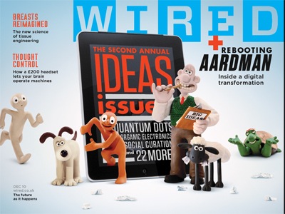
For those articles that did come from the US edition, it was interesting to see how they were presented differently. Some just had simple layout changes, while others, like the piece below, not only appear with a completely different look, but the context for most of the content is different (like the inclusion of a column by Clive Thompson inside the main feature).
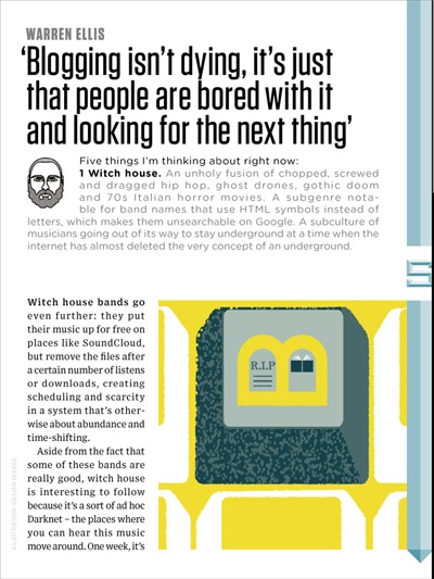
I was also happy to finally get to read Warren‘s regular column in the form that it should be read in — in magazine form, and not on the web. The topic was also certainly apropos for being included in the first iPad edition of the magazine (“Blogging isn’t dying, it’s just that people are bored with and looking for the next thing”).
I briefly mentioned earlier that ads appear in both portrait and landscape modes, but it also needs to be said that not only does there appear to be more ads than in the US edition — I would find myself having to flip through 2-3 ads between articles — but there are also more “Wired Promotion” pieces (i.e. advertorials). I know that in recent years I would see a lot of these in the print edition of Wired US, but so far the iPad edition hasn’t had too many (I believe just one). Here, we get a few of them, like the one below, which to me is just wasted space as I never read them.
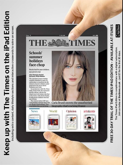
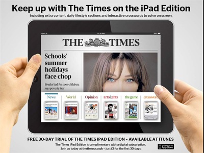
And the ads for the most part don’t do much with the medium, but I did quite like the one you see below for The Times‘ iPad app, which plays a visual trick on the two iPad modes.
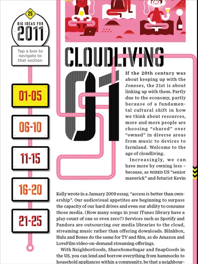
In many of my past reviews I’ve often stated how I prefer “screen” flips over scrolling, and Wired UK pretty much sticks with what we’re used to seeing in the US edition, making an exception in two pieces. I can see why they would go that way in their “Big Ideas for 2011” feature, using a blog format similar to the front section of the iPad edition of Esquire — you can tap the sections in the sidebar to move to a new group of “ideas” — but I really don’t like that they have artificially put a space jump in the opening text of each section (as seen below) so that that “opening” screen looks nice and not cut.
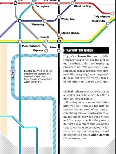
They do the same in the article below, which has a fun interface — you touch on each subway stop to read what it’s about — but again they put an artificial space in the text, which just looks odd when you move or scroll the page up.
There are also strange bugs that they need to iron out — and let’s be clear, they do clearly explain in the intro that this is a test issue, and that they hope to get feedback and improve things for the upcoming issues that will start coming out in 2011. One thing I noticed was that when you have your iPad synced with your computer and you access the “File Sharing” section of iTunes, you can see the files that make up the issue — I’m sure this was not intended.
Also, since the release of the issue last week, they’ve been making updates to it, but that I can’t experience because they appear as separate issues (v.1.2, v1.3) inside the app that I need to buy. Surely this is a mistake.
Is it worth buying? I’d say yes, especially if you love the US edition. The price is the same ($4), and they have already announced that they are looking into offering subscription offers. They also promise that upcoming editions will include ways to share pages with others, which is a feature I’d love to see in the US edition as well. Give me the ability to interact with the text (copy/paste, notes, etc.) and I’ll be a pretty happy reader.
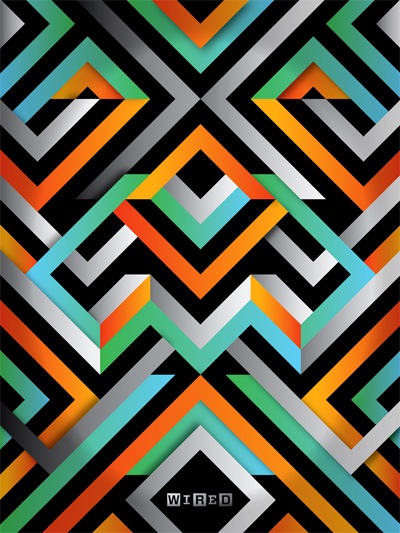
I leave you with the opening graphic to the app, which I think is much nicer than any of the ones that have appeared in the US edition.